It's light yellow-orange in colour, like on the second picture below (with the days still so short, I only get decent light for taking pictures during the weekend).
I didn't really know what to do with this paper at first. One because of its colour, and two, and more importantly, because it's too thin to take water well.
I guess the other type of paper I mentioned in my previous post is very thin as well, but it can be compared to Chinese calligraphy paper in a way.
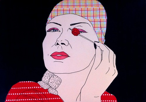
Over time I have started adding colour besides the washi tape to these drawings. I feel the results are really hit or miss, for it's not easy to choose the right colour and, more importantly, to know when to stop adding to the drawing.
On this drawing, I have mixed feelings about the black background. On the one hand it really makes the subject stand out, but on the other maybe black was a bit too radical a choice?
 |
| Why so gloomy? |
 |
| Fogged glasses... I know the feeling, girl! |
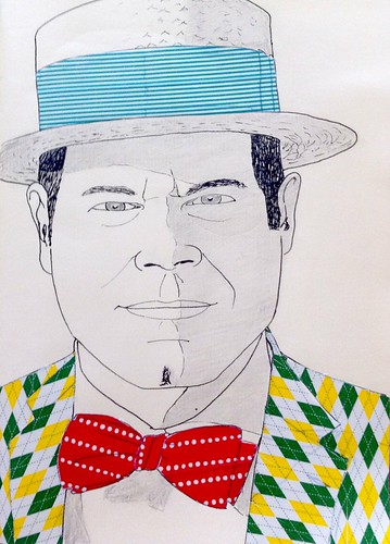 |
| How wonderfully dapper you are, Sir ! |
No comments:
Post a Comment