After fumbling just a little, I have come to the obvious conclusion that I cannot use the same technique for all types of paper.
I'll be posting a few insights I gathered during my experimentation.
The first type few sheet is made of some kind of fibre I don't recognise and looks really beautiful. It is, however, the trickiest to work with in my opinion.
The first drawings I made on it, which I already posted, were made with a simple felt pen, so I didn't quite understand it until I tried using watercolour.
For my first attempt, I kept my brush very dry and remained very careful when adding colour, so, although the result is a bit unexpected, I like the happy accidents.
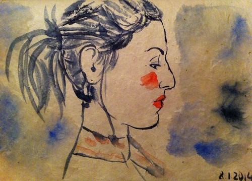 |
| The red was a spur of the moment addition that works well in my opinion |
Although I don't dislike the result, I'm still a bit disappointed. I don't know if it's because the colour bled so much or the black felt pen that is too "radical" here. The fact is I was aiming for something lighter.
 |
| My impatience made everything runnier... |
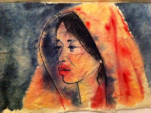
So I learned that I had to be a tiny bit more patient when using watercolour on this paper, and let it dry as much as possible. Which is what I did for this next drawing, at least until I tried adding some shawows in the face.
Again, the watercolour went a bit wild here, but I like it. I could have done with a tiny bit less on the cheek, but the result is quite moody, which is what I was aiming for.
I also experimented with Tombow brush pens, which I love to use. On this paper I still need to be carefull with the bleeding, but less than with watercolour, so I can control the outcome a bit better.
The hue of colours can be a little bit unpredictable, though. For example, the pen I used for the shading on these portraits was blue, not grey.
Again, the watercolour went a bit wild here, but I like it. I could have done with a tiny bit less on the cheek, but the result is quite moody, which is what I was aiming for.
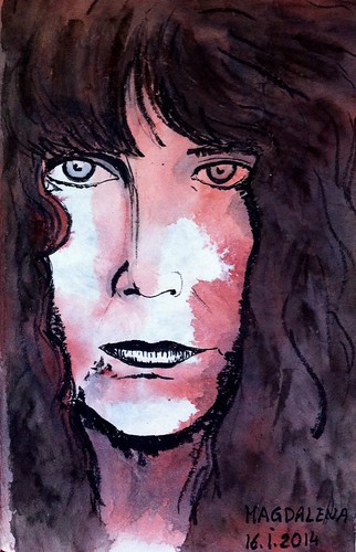 |
| The original picture looks like an image from an old silent film |
The hue of colours can be a little bit unpredictable, though. For example, the pen I used for the shading on these portraits was blue, not grey.
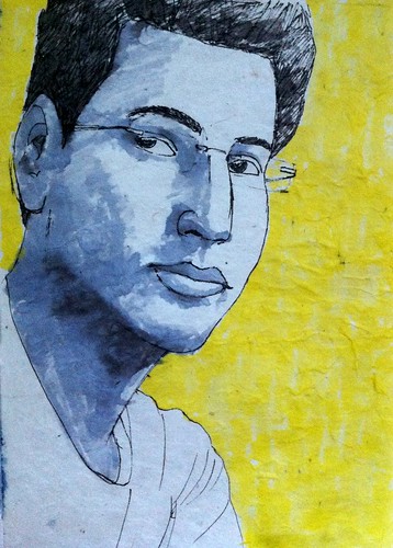 |
| I went a bit bold with the yellow. More dynamic. |
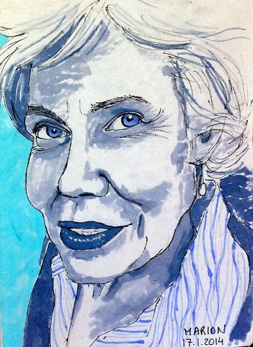 |
| I later found out that Marion's favourite colour is blue :) |
For this last one I also used Tombow, but tried different colours. The difficult thing when using them on this paper is that the fibres get a bit stuck on the brush, so you need to clean it from time to time. It's particulalry visible on the grey area on the bottom right part of this portrait.
I really enjoyed playing with this paper. I learned that I had to be more patient when drawing with watercolour and to enjoy unexpected outcomes. Nothing really new I guess, but it's still good to be reminded.
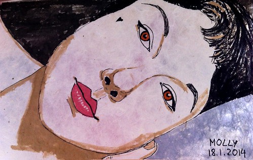 |
| I love the colour of the lips here |
No comments:
Post a Comment