Pages

Monday, 17 February 2014

Different paper, different styles - part 3

Next type of paper in this Lamali sketchbook is plain white paper like the one from a normal notebook, so I can't use watercolour here either.

At least not with much success, haha.

So I decided to try out a more comic-like approach for these portraits. I have to say I have a lot of fun with them. Probably because I love comics.

For my first attempt, I stuck to only using my brushpen. Baby steps.

Grace for JKPP
I might add some colours in the balloons one day
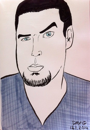
For the next one I wanted to try making something more caraicature-like. Caricatures are not my strong point, though. But I got the expression right.

David for JKPP
Bad quality photo, sorry...
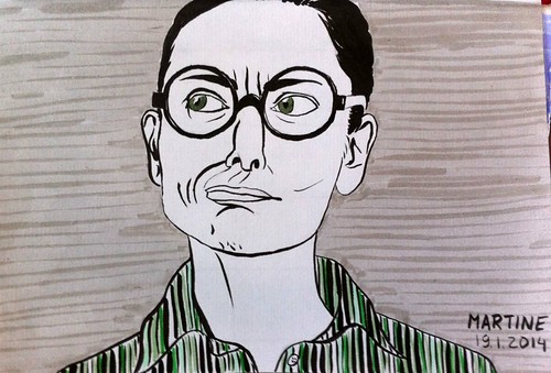
I loved the face Marine was making in the reference picture of my next portrait. She seems to be a very funny person.

Marine for JKPP
I got her name wrong here. She's Marine, not Martine!
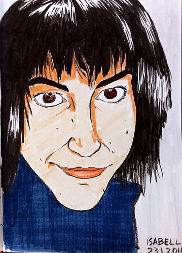
In this one I started adding colour and skin tone with markers, to make it a bit more real while remaining in the comic style. I'm not satisfied with the likeness, but I like the expression.

Isabell for JKPP
I met her in Barcelona, she seems really nice
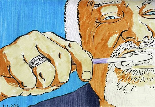
The next two I chose because I liked the challenge, of the composition for the first one, and of the very distorted face for the second one.

Kline for JKPP
It was a fun composition to try out
The skin tones were particularly interesting to try out.

Evgeny for JKPP
Glasses are a challenge by themselves...
So far these pages are the ones that show a greater evolution, in my opinion. It might have to do with the fact that the medium is much easier to use, while at the same time forcing me to make more radical decisions in my choices.

One thing I find interesting is that while at the beginning I would invest half an hour tops for one drawing, now I can sit more than one hour working on one single portrait. I'm becoming a more patient person, haha.

Friday, 14 February 2014

Different paper, different styles - part 2

The next type of paper in my Lamali sketchbook series is the one I use for my portraits with washi tape.

It's light yellow-orange in colour, like on the second picture below (with the days still so short, I only get decent light for taking pictures during the weekend).

I didn't really know what to do with this paper at first. One because of its colour, and two, and more importantly, because it's too thin to take water well.

I guess the other type of paper I mentioned in my previous post is very thin as well, but it can be compared to Chinese calligraphy paper in a way.

Over time I have started adding colour besides the washi tape to these drawings. I feel the results are really hit or miss, for it's not easy to choose the right colour and, more importantly, to know when to stop adding to the drawing.

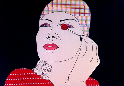
On this drawing, I have mixed feelings about the black background. On the one hand it really makes the subject stand out, but on the other maybe black was a bit too radical a choice?

Catalina for JKPP
Why so gloomy?
I had fun with this next one. On the original picture, the glasses are fogged, so I wanted to recreate that effect with the tape somehow. In the end, it probably looks more like she has dark glasses on, but that's ok.

tilley200 for JKPP
Fogged glasses... I know the feeling, girl!
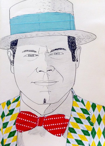
On this last drawing, I didn't think it would be wise to add even more colour, seeing as the patterns were already so strong, so I only shaded some areas with pencil. I might make them darker, though.

Quentin for JKPP
How  wonderfully dapper you are, Sir !
I really need to improve the pictures I take. On this last picture the paper looks so grey! Not at all the right colour. The washi tape looks good, though...

Wednesday, 12 February 2014

Different paper, different styles - using my Lamali sketchbook

As I wrote before, I have this Lamali sketchbook with different types of paper which I use for portraits for JKPP.

After fumbling just a little, I have come to the obvious conclusion that I cannot use the same technique for all types of paper.

I'll be posting a few insights I gathered during my experimentation.

The first type few sheet is made of some kind of fibre I don't recognise and looks really beautiful. It is, however, the trickiest to work with in my opinion.

The first drawings I made on it, which I already posted, were made with a simple felt pen, so I didn't quite understand it until I tried using watercolour.

For my first attempt, I kept my brush very dry and remained very careful when adding colour, so, although the result is a bit unexpected, I like the happy accidents.
Jo Kettlewell for JKPP
The red was a spur of the moment addition that works well in my opinion
I got a bit cockier with the second one, less careful, and discovered that the water bleeds a lot on this paper. Every drop of water seems to just spread to three times the area I want it to...

Although I don't dislike the result, I'm still a bit disappointed. I don't know if it's because the colour bled so much or the black felt pen that is too "radical" here. The fact is I was aiming for something lighter.
Sol or JKPP
My impatience made everything runnier...
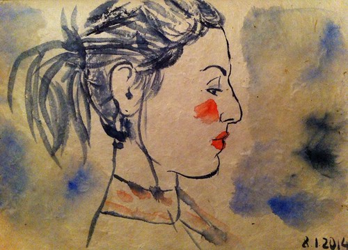
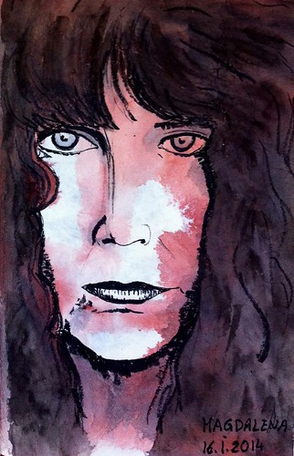
So I learned that I had to be a tiny bit more patient when using watercolour on this paper, and let it dry as much as possible. Which is what I did for this next drawing, at least until I tried adding some shawows in the face.

Again, the watercolour went a bit wild here, but I like it. I could have done with a tiny bit less on the cheek, but the result is quite moody, which is what I was aiming for.
Magdalena for JKPP
The original picture looks like an image from an old silent film
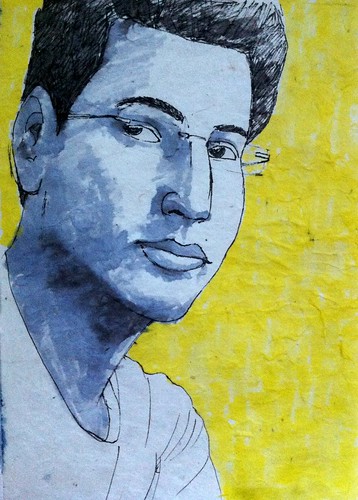
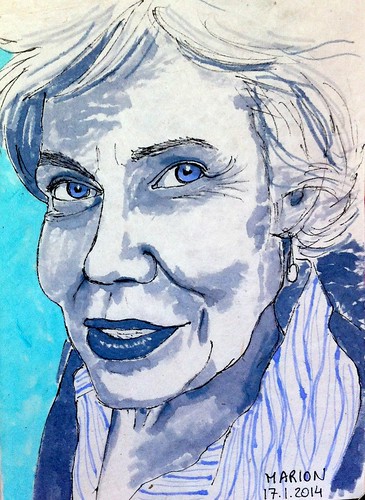
I also experimented with Tombow brush pens, which I love to use. On this paper I still need to be carefull with the bleeding, but less than with watercolour, so I can control the outcome a bit better.

The hue of colours can be a little bit unpredictable, though. For example, the pen I used for the shading on these portraits was blue, not grey.

John Rajesh for JKPP
I went a bit bold with the yellow. More dynamic.
Marion for JKPP
I later found out that Marion's favourite colour is blue :)
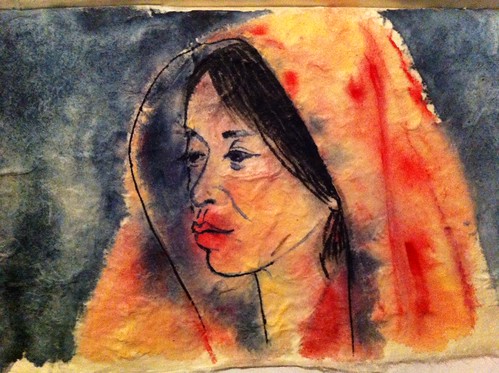
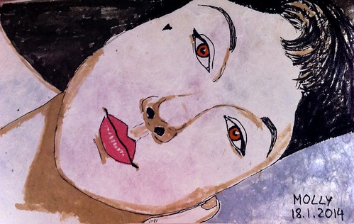
For this last one I also used Tombow, but tried different colours. The difficult thing when using them on this paper is that the fibres get a bit stuck on the brush, so you need to clean it from time to time. It's particulalry visible on the grey area on the bottom right part of this portrait.
Molly for JKPP
I love the colour of the lips here
I really enjoyed playing with this paper. I learned that I had to be more patient when drawing with watercolour and to enjoy unexpected outcomes. Nothing really new I guess, but it's still good to be reminded.

Sunday, 9 February 2014

February mail art

This month's mail art exchange was organised by Sylvie, aka Bigoudène, again on her blog Carnets de... vie.

The subject is RAIN and here is my submission.

Little girl under the rain, standing in front of a puddle
I was inspired by this video of a toddler experiencing her very first rain. Check it out, it will make you smile.

This time I didn't glue the envelope and instead made a drawing on the inside as well. It's a concept a participant of another mail art exchange used and I liked it. This way the story continues.

My little girl is older than the one on the video and can't resist jumping into the puddle.

Happy childhood memories :)
UPDATE: It has just rained fish on my mailbox! :)

Such a creative and fun idea! I love it!
Front view
Back view
And Corinne included a little message inside the envelope. I didn't know there would be a gathering in Sète in June. Who knows, I might be able to go :)

Saturday, 8 February 2014

Virtual Paintout February 2014: Washington, DC

This month's location for the Virtual Paintout is Washington, DC.

A lot to see, and I tried to find an interesting angle of the White House, but I didn't see anything that I particularly wanted to draw.

After strolling virtually through the streets of the US capital, I found this statue that I liked. I think it was because of the light shining through the flag.

Here is the Google Streetview reference image.

Washington, DC - February 2014
I like how dynamic the memorial looks.

Thursday, 6 February 2014

A few days in Vienna - last day

Just like the previous day, I had breakfast at a cafe, this time Cafe Sperl. I actually searched for it because it was listed on Vienna's tourist website.

Snooty waiters again, but I was used to it by now, so I didn't mind. Plus the place was, once more, really beautiful.

I tried to sketch a small part of it. I'm not sure adding colour was such a good idea, but since all my sketches are more a way of practising than finished products, I can't say that I regret doing it.

Cafe Sperl
I had to call the lady back because she was forgetting her mobile phone
I went to the Schmetterlinghaus (butterfly house) immediately afterwards. This time I was able to enter this small piece of tropical atmosphere. The arched glass house is really pretty and pleasant, particularly when it's so cold outside.

However, I was a tiny bit disappointed to find only one type of (really beautiful) butterfly. I had imagined being surrounded by many colourful winged beauties, like in a movie or something, hahaha. It was probably not the best period of the year to go there, I guess.

Schmetterlinghaus
There were "owl butterflies" everywhere
After my visit there I remembered that I hadn't actually seen that much of the city as such. The cold was not really inviting me to stroll around. So I decided to do the typical hop-on hop-off bus tour of the centre, stopping here and there for a short walk and photographs.

Which only confirmed to me that Vienna is really a very beautiful and grand city. You can feel that it used to be the centre of an empire, with all its past grandeur.

I had lunch at Cafe Landtmann, which I had spotted from the bus. Apparently it was and still is a very popular place with intellectuals. Freud, for example, used to go there.

I entered what must have been the nicest cafe yet, with even a coat check at the entrance. Very chic. For some reason, I was expecting something a bit more bohemian, like a Parisian cafe in Montmartre.

I think I was one of the only tourists there. Around me I saw many meetings taking place. Must be a great way to do business.

The waiters were very friendly and I had the biggest Apfelstrudel in my life.

Cafe Landtmann
These two were not doing business, I think.
I still had time to go to the Museumsquartier, a logical addition to my improvised museum marathon. Apparently that area used to be the court stables before it was renovated. Today it gathers many museums and other cultural places.

I first went to the Leopold museum because I had seen posters advertising exhibitions on early works of Schiele and Klimt, plus an exhibition of Kupka, and I wanted to continue exploring my newfound appreciation for Schiele's art in particular.

I was sad to learn throught the audioguide that the artist died aged 28. It's so young and such a pity for the art world...

I stopped at the Leopold cafe for a quick bite and went to the neighbouring Mumok (museum of modern art) afterwards. I have to admit that modern art, conceptual art and the like are always hit or miss for me. I have a hard time seeing most of the works as art instead of just ideas. Plus many of them seem obscure and sometimes even flimsy to me. It's often like the author is not really trying to share something with the viewer, and I miss that connection.

The Mumok was hosting a collective exhibition called And Materials and Money and Crisis. The title seems quite self-explanatory, but appart from 2-3 pieces that fit the concept, I didn't really see the point of most of them. At least in this context.

There were a few pieces I found interesting, though. Probably more as concept than as art, but in any case appealing. One of them was a room in which the atmosphere had been changed so it was full of mist. There was a whole explanation on atmosphere, climate, pollution, etc. I think I liked it because it was an installation to which the viewer was supposed to actively participate, and the message seemed relatively clear.

It looked roughly like this. The image is not very clear, but since the room was full of mist, it's fitting.

Mumok
The title was very long, something like: Sea, Salt, Water, Sand, Climate, etc., etc.
So Mumok was the last stop on my discovery of Vienna. There is a very nice cafe there as well, with beautiful cupcakes to choose from. 

My trip was very short, but successful and I will definitely want to go back to see more and maybe sketch outside next time. The people are very helpful and friendly (except for a few snooty waiters ; but that's probably because I chose the "wrong" places). I didn't have time to see any of the court buildings, the equestrian school, the Freud museum, Schönbrunn, etc. 

That will be for next time.

Wednesday, 5 February 2014

A few days in Vienna - day 2

My second day in Vienna started with a big breakfast at Cafe Schwarzenberg. It is a beautiful and elegant place. One thing you would not see in Luxembourg: people having beakfast in a stylish cafe in the middle of a Wednesday morning. although I have to say that many of them looked like business people having a meeting or something.

I was disappointed once more by the snootiness of the waiters. Like being snob was a requirement to be a waiter in such a beautiful place, haha.

And again I had to think of Prague: the friendliness of the waiters there doesn't quite express itself in a manner you would expect either. However, they seem more bothered by their clients than snob there, haha.

I had the time to make a quick sketch of the place and later added shadows with a pencil I bought in MAK the previous day.

Cafe Schwarzenberg
The piano was calling to me: Sketch me! Sketch me!
After gaining strength from my delicious breakfast, I went to the Belvedere, where Klimt's Kiss is exhibited.

I first visited the lower Belvedere and the temporary Emil Nolde exhibition they had at the time. I knew of the artist, but not much, so it was really interesting to discover his art. I fell in love with one of his paintings, Meer III.

I had a short break on a bench with a direct vue of the upper Belvedere, which I quickly sketched, and a nice chat with an old lady sitting next to me and admiring the vue. She told me it was the first time she saw the Belvedere with snow. Lucky me!

Belvedere
Groups of children were passing by and telling me I made nice drawings :)
The upper Belvedere is bigger than the other one and has a big variety of art and other items. There was even one room with stuffed animals. I don't really like those, but the strange bird attracted me and I continued sketching other animals.

There was also a stuffed tiger, but the look on its face was so sad and strange that I couldn't bring myself to even try to sketch it.

Animals
The fierce hyena was more interesting
The upper Belvedere not only hosts a few of Klimt's nicest works, but also very beautiful paintings by Egon Schiele. Not the usual nudes you would think of when talking about the artist, but, in my opinion, more interesting works.

I completely fell in love with Die Umarmung (The embrace), for example, and had to sketch it. The colours I added later are not at all like the original painting, though.

Schiele - Die Umarmung
Call me crazy, but I actually like Schiele's embrace it more than Klimt's kiss
I had lunch at the Belvedere's Menagerie. A small pink cafe with huge portraits of Sissi and Frank Joseph.

There was a group of Asian women at a table nearby. They looked both cute and funny, specially the older lady, so I quickly sketched them. I don't think they noticed me.

To my horror, my nice Hiro pen went dry in the middle of the process, so I continued with a Pentel brushpen. I added colour later.

Menagerie
I think they were Chinese
In the afternoon I searched for the butterfly house. Yes, I go to Vienna, not to see Sissi's palace, but to see butterflys, haha. Unfortunately, when I finally found it, it was almost closing time, so I decided to postpone it to the following day.

And anyway, the Sacher Stube, where the famous Sacher Torte comes from, was in the area and also an item on my list, so I went there instead.

Another very cute place, where the friendly waitress was dressed as a soubrette. I am amazed at the number of cute pink walls I see in cafes around Vienna.

Cafe Sacher
The blonde woman was smoking an electronic cigarette very stylishly. I didn't think that was possible.
I finished the day at the Albertina where I found an exhitibion of paintings from various periods, from Monet to Picasso it was called.

I'm not particularly a fan of Monet, not in the strictest sense, but I really enjoyed a painting of a pond of waterlilies. The sky was mirrored in it so wonderfully, I was quite in awe.

Most rooms at the Albertina were closed because of the humidity. However, one room with beautiful statues of the muses was accessible, so I quickly scribbled their names and drew their major characteristics for future reference. I think I should have written down what they stand for as well, for there are a few ones I don't remember already. Oh well, there's always Google for that.

Muses
The statues were much more beautiful, I assure you, haha