Pages

Friday, 28 February 2014

A Portuguese guitar and a traffic light

A few weeks ago I agreed to exchange custom-made postcards with an Italian sketcher, Alessandro Melillo.

I saw on his Facebook profile that he played the guitar, so I thought that a drawing of a Portuguese guitar would suit him.

It turns out he also plays this instrument, so as the French say: chance does things well, haha.

I love the shape and sound of this instrument
In return, I received this pretty traffic light. 

Italian traffic light.
I never thought of drawing one, but I think I might give it a try sometime.

Thursday, 27 February 2014

PIFAL - honouring the arts and letters

PIFAL, or Portraits of illustrious figures of the arts and letters, is another Flickr group dedicated to portraits. More specifically, as its name so aptly says, portraits of known artists, writers, actors, etc.

What I think is interesting about this group, apart from the very impressive work I see there, is that I get to discover artists and writers from different corners of the world and of whom I had never heard before.

For my first contribution I chose to make a portrait of the Portuguese writer José Saramago. I have read a few of his books (ex. Blindness) and, after some getting used to his style, I really love reading his stories. They are always very intelligent and philosophocal, and never boring.

So I thought it would be a way of promoting him a little.

José Saramago
I love how bored he looks in this picture
In keeping with my idea of promoting Portuguese artists, I chose Fernando Pessoa as my next subject. He's been sketched and caricatured so much already that I think I got a bit influenced by the portraits I have seen of him more than by the reference photo.

He must be one of the most interesting poets I know of. He created various personas (called heteronyms) under whose names and personalities he would write. They were not simple pen names, but more like separate writers with different lives, interests and styles.

Fernando Pessoa for PIFAL
Alberto Caeiro, Ricardo Reis, Álvaro de Campos, Bernardo Soares, etc.
For my last contribution so far I chose Romy Schneider. Most people know her better for her iconic role as Austrian empress Sissi, and that's also how I discovered her when I was a child.

But she grew out of that role when she moved to France to become one of the country's most beloved actresses.

She even starred in Hollywood movies (e.g. Orson Welles' The Trial and What's new Pussycat? with Peter O'Toole, Woody Allen and Peter Sellers).

Her acting was always very humane and sensitive. To me she embodies what most actresses should strive for.

Romy Schneider
She even learned style from Coco Chanel herself

Monday, 24 February 2014

Weekend in Paris

A couple of weeks ago, I went to Paris with a few friends to see an exhibition on Pixar animation.

One of our friends was unable to come, so we prepared a little surprise for her over lunch: 5 postcards (because we were 5) on which we wrote a story spanning over all of them.

The idea was that she would get one postcard per day and would only find out the whole story piece by piece.

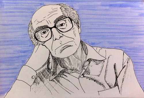
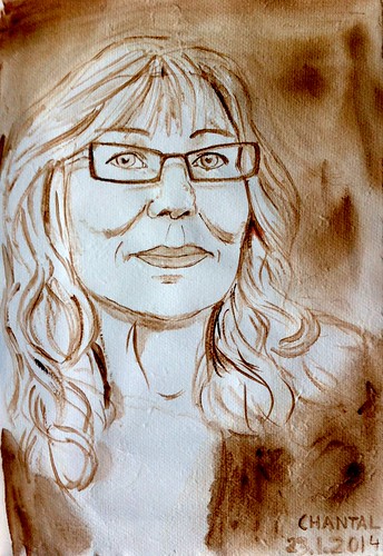
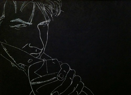
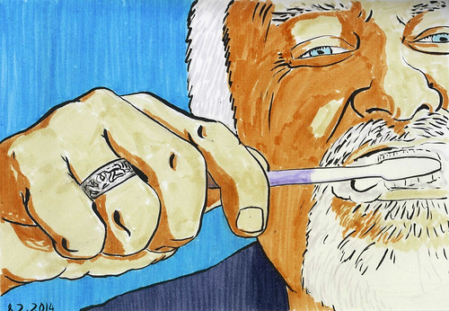
I squeezed in a quick sketch of my friend Annick, who was trying to find a name for the main character using  the first letters of all our names. Needless to say the name got very strange, haha.

Annick
So many weird names to choose from...
I was staying at my friend Tula's apartment. I met her at the Urban Sketchers Symposium in Barcelona last year. She even arranged for a sketching evening with other Paris sketchers.

I was pleasantly surprised at the turnout and also to see some people I had also met in Barcelona but not kept in contact with.

I wasn't very inspired, specially at first. Maybe because of the very busy scene or maybe just because I kept chatting with people and wasn't focusing much.

Café de l'industrie
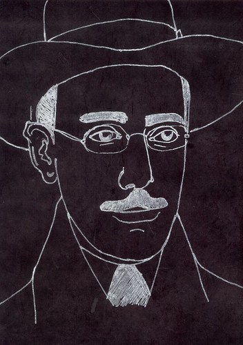
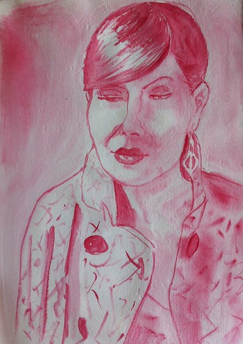
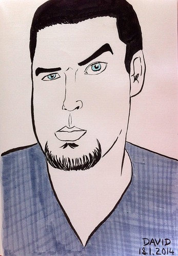
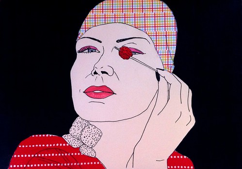
Marion's profile on the right, Myrto on the left.
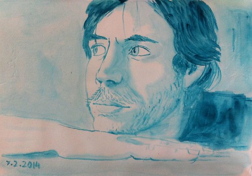
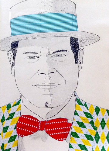
One of the sketchers told me to try a bit of blind drawing, which turned out quite good, I think. I like how the lines are more simple and clear. It wasn't done all without looking. I had to look down to determine where to put my pen, but the lines themselves were made without looking at the page.

Myrto
I like this result better than the previous one
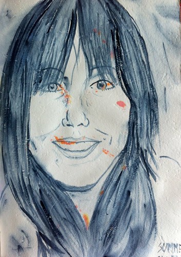
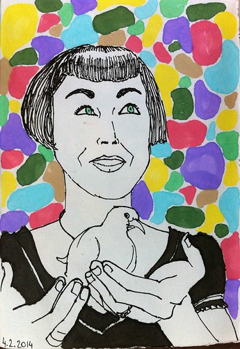
I also met Kim, the administrator for the Paris Sketchers Flickr group. She invited me to upload my sketches as well.

Kim
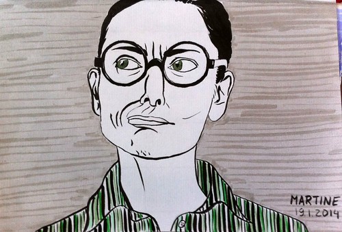
Kim, very focused on her craft
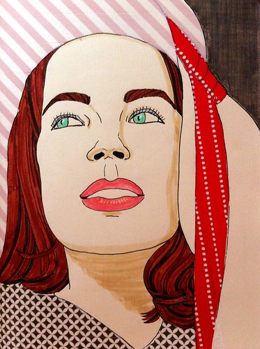
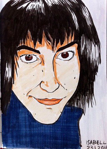
It's always such a great feeling to meet other sketchers! I sketched Myrto the most. Actually, I think everyone must have sketched her, for she was sitting in a very strategic place. She didn't notice it at first.

She has a beautiful face. My last sketch doesn't do her justice, she looks much younger in reality.

Myrto
Myrto comes from Greece
On Sunday morning I had time to make a sketch of the view from Tula's apartment. I think I will add some colour later on.
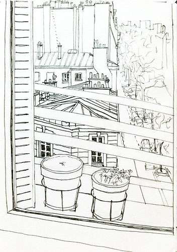
Vue appart
So very Paris...
It was a lovely morning, very sunny. Tula showed me around a bit and gave me some tips for my next trip. There were many people jogging along the Seine, probably training for the semi-marathon taking place next week.

We sat down for some quick sketching of the Pont Neuf. I always recall my history classes when I think about this bridge. Our teacher kept repeating that what was so special about this bridge at the time it was built, was the fact that there were no houses on it. Today that seems like such a normal thing.

I think I'll try adding some blue colour splashes on this one.

Pont Neuf
No houses on this bridge! How shocking!
It was great to be in Paris again. I love to visit from time to time, it's such an interesting city. I'm not sure I would enjoy living there for a long time, but it's definitely great for a few short holidays.

Thursday, 20 February 2014

Different paper, different styles - part 5

Last type of paper, I promise!

I actually didn't notice it at first, only after filling quite a few pages. My observation skills are unsurpassed, haha!

Again, I don't quite know how to describe these pages. They're slightly grey and porous.

My pencils don't make strong enough marks on this paper, so I thought it best to use watercolour.

It's not as tricky to work with as the first few pages in the sketchbook (or maybe I have just changed my approach), but I have to be very careful with the amount of water I use, and wait for the paper to dry correctly before putting more detailed lines.

I also have to put something under each page when I work on this paper, otherwise the pages below get easily stained, like on this portrait.

Summer for JKPP
I guess it makes the portrait more interesting...
I'm learning to master my brushes and the amount of water I use in watercolour with this paper.

Sylvie for JKPP
Once again, I got the name wrong... She's Sylvie, not Chantal!
After a couple of portraits I started to add some shading. Always very carefully, for the paper is quite capricious. It does make for very soft transitions, though, which I really like.

Catalina for JKPP
She's much lovelier in reality. Very elegant.
I tried using markers, too, but I didn't really like the result. For one thing, the colour continues bleeding a bit after I finish drawing and for another the lines are not as smooth as I would like them to be.

I might give this technique another try later on, when I get tired of using only watercolour

Karen for JKPP
I think I'll use her picture again. I feel like great things can be done with it.
This paper is teaching me patience once more. So far I like the overall results I'm getting

Stuart for JKPP
Looks like his hand is disconnected from the rest of his body...
I have to say I'm having a lot of fun filling this sketchbook. I feel there has been development in each of the styles I'm using, which is very motivating.

Thanks again, Marisa, for the wonderful present! ^_ ^

Wednesday, 19 February 2014

Different paper, different styles - part 4

There are a few black pages in this Lamali sketchbook.

Not plain black paper, but beautifully thick with pressed fibres. Really gorgeous.

I wasn't really sure what to do with it, though, haha.

For one thing, I'm not used to working with black paper, and for another I don't have many tools to work with it.

Watercolour is out of the question and brushpen and the like also.

So for now I am using a white gel pen to work in very clean lines.

Jacques for JKPP
Cheers!
It's a good exercise to force myself to decide which lines to put an which ones to ignore.

Monday, 17 February 2014

Different paper, different styles - part 3

Next type of paper in this Lamali sketchbook is plain white paper like the one from a normal notebook, so I can't use watercolour here either.

At least not with much success, haha.

So I decided to try out a more comic-like approach for these portraits. I have to say I have a lot of fun with them. Probably because I love comics.

For my first attempt, I stuck to only using my brushpen. Baby steps.

Grace for JKPP
I might add some colours in the balloons one day
For the next one I wanted to try making something more caraicature-like. Caricatures are not my strong point, though. But I got the expression right.

David for JKPP
Bad quality photo, sorry...
I loved the face Marine was making in the reference picture of my next portrait. She seems to be a very funny person.

Marine for JKPP
I got her name wrong here. She's Marine, not Martine!
In this one I started adding colour and skin tone with markers, to make it a bit more real while remaining in the comic style. I'm not satisfied with the likeness, but I like the expression.

Isabell for JKPP
I met her in Barcelona, she seems really nice
The next two I chose because I liked the challenge, of the composition for the first one, and of the very distorted face for the second one.

Kline for JKPP
It was a fun composition to try out
The skin tones were particularly interesting to try out.

Evgeny for JKPP
Glasses are a challenge by themselves...
So far these pages are the ones that show a greater evolution, in my opinion. It might have to do with the fact that the medium is much easier to use, while at the same time forcing me to make more radical decisions in my choices.

One thing I find interesting is that while at the beginning I would invest half an hour tops for one drawing, now I can sit more than one hour working on one single portrait. I'm becoming a more patient person, haha.

Friday, 14 February 2014

Different paper, different styles - part 2

The next type of paper in my Lamali sketchbook series is the one I use for my portraits with washi tape.

It's light yellow-orange in colour, like on the second picture below (with the days still so short, I only get decent light for taking pictures during the weekend).

I didn't really know what to do with this paper at first. One because of its colour, and two, and more importantly, because it's too thin to take water well.

I guess the other type of paper I mentioned in my previous post is very thin as well, but it can be compared to Chinese calligraphy paper in a way.

Over time I have started adding colour besides the washi tape to these drawings. I feel the results are really hit or miss, for it's not easy to choose the right colour and, more importantly, to know when to stop adding to the drawing.

On this drawing, I have mixed feelings about the black background. On the one hand it really makes the subject stand out, but on the other maybe black was a bit too radical a choice?

Catalina for JKPP
Why so gloomy?
I had fun with this next one. On the original picture, the glasses are fogged, so I wanted to recreate that effect with the tape somehow. In the end, it probably looks more like she has dark glasses on, but that's ok.

tilley200 for JKPP
Fogged glasses... I know the feeling, girl!
On this last drawing, I didn't think it would be wise to add even more colour, seeing as the patterns were already so strong, so I only shaded some areas with pencil. I might make them darker, though.

Quentin for JKPP
How  wonderfully dapper you are, Sir !
I really need to improve the pictures I take. On this last picture the paper looks so grey! Not at all the right colour. The washi tape looks good, though...